How a Browser Turns Markup Into a Page
Parsing, the DOM, style matching, layout and paint. Knowing this pipeline explains why script placement matters, why images need dimensions, and why broken markup still renders.
-
HTML Basics
- What is HTML: The Structure Layer of Every Web Page
- HTML Document Structure: DOCTYPE, html, head and body
- Elements, Tags and Attributes: The Vocabulary of HTML
- HTML Comments: Notes That Ship With Your Code
- Block Level and Inline Elements
- Writing and Running Your First HTML Page
- How a Browser Turns Markup Into a Page
- Text and Formatting
- Links and Navigation
- Images and Media
- Lists
- Tables
-
Forms
- Form Structure: form, action and method
- Input Types: Text, Email, Number, Date and the Rest
- Labels: The Most Important Element in a Form
- Checkboxes, Radio Buttons and Grouping
- select, option, optgroup and datalist
- textarea, File Uploads and Hidden Fields
- Buttons: submit, reset and button
- Built In Form Validation
- GET or POST: What Happens When a Form Is Submitted
- Semantic HTML
- HTML5 Features
- Head and Metadata
- HTML with CSS
- HTML with JavaScript
- Accessibility
-
HTML SEO
- How Google Works: Crawling, Indexing and Ranking
- SEO Friendly HTML Structure
- Titles and Descriptions That Earn Clicks
- Headings and Content Structure for Search
- Internal Linking and Anchor Text
- robots.txt and XML Sitemaps
- Canonical URLs and Duplicate Content
- Structured Data and JSON-LD
- Image SEO
- Core Web Vitals and Mobile Friendliness
- DevTools and Debugging
- Editor Productivity
- HTML Best Practices
- HTML Projects
- Advanced Projects
- Practice and Exams
Concept
Between the moment a file arrives and the moment a reader sees it, the browser runs a fixed pipeline. Understanding it is what turns a list of memorised rules - put scripts at the end, set width and height on images - into rules you can reason about.
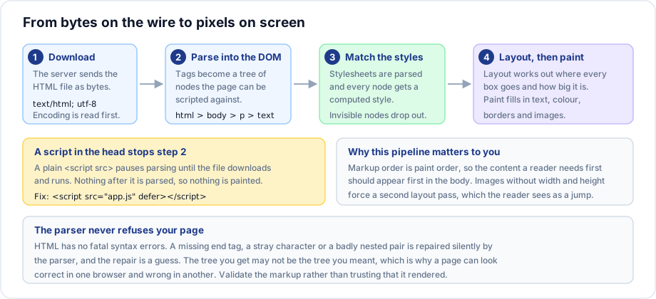
The five steps
1. Bytes to characters
The file arrives as bytes. Before anything can be read, the browser needs the character encoding, which it takes from the HTTP header or from <meta charset>. This is why the charset declaration belongs in the first bytes of the head: declare it late and the browser has already guessed, and a wrong guess turns every non ASCII character into a mangled symbol.
2. Characters to the DOM
The parser reads the character stream and builds the Document Object Model: a tree of nodes where every element is a node and every element inside it is a child. The DOM is what CSS matches against and what JavaScript manipulates. It is built as the file streams in, not after it finishes downloading, which is why a long page starts appearing before it has fully arrived.
<body>
  <h1>Title</h1>
  <p>Some <em>text</em>.</p>
</body>
body
├── h1
│ └── "Title"
└── p
├── "Some "
├── em
│ └── "text"
└── "."3. Styles are matched
Stylesheets are parsed into their own model, then every node gets a fully computed style: the browser default, overridden by your stylesheet, overridden by inline styles. Nodes that end up invisible - display: none, and everything inside head - are dropped and never take part in layout.
4. Layout
The browser walks the styled tree and works out the geometry: how wide is each box, how tall, and where does its top left corner sit. This is the expensive step and it depends on the viewport, so it runs again on every resize and on anything that changes a size.
5. Paint
Finally the pixels: text, backgrounds, borders, shadows and images, drawn in the order the layers require.
Why a script in the head stops everything
A plain <script src> blocks the parser. The browser stops building the DOM, downloads the file, executes it, and only then continues. Everything below that line is unparsed and therefore unpainted, so the reader stares at a blank page for the duration.
<!-- blocks parsing right here -->
<script src="/scripts/app.js"></script>

<!-- downloads in parallel, runs after parsing, keeps document order -->
<script src="/scripts/app.js" defer></script>

<!-- downloads in parallel, runs the moment it arrives, order not guaranteed -->
<script src="/scripts/analytics.js" async></script>
The historical fix was to put scripts at the very end of the body. defer is better: the download starts early and runs in parallel with parsing, and execution still waits for a complete DOM.
Why images need width and height
When layout runs, an image whose dimensions are unknown is given no space. The text below it moves up to fill the gap. When the image finally arrives, layout runs again and everything jumps down - the reader loses their place, or taps the wrong thing. Stating the intrinsic size lets the browser reserve the correct box on the first pass.
<img src="/images/hall.jpg" alt="An empty lecture hall" width="1200" height="675">The numbers describe the aspect ratio; CSS is still free to resize the image. This is the single cheapest fix for layout shift, which Google measures directly as Cumulative Layout Shift.
Why broken markup still renders
HTML has no fatal parse errors. A missing end tag, an overlapping pair, a stray bracket - the parser repairs all of it and carries on, following recovery rules in the specification. The repair is a guess, and the tree you get may not be the tree you wrote.
<p>First paragraph
<p>Second paragraph
Here the parser closes the first paragraph when it meets the second opening tag, and the result happens to be what you meant. Now try this:
<p>Total: <div>1,200</div></p>A paragraph cannot contain a div, so the parser closes the paragraph before the div, leaves the div as a sibling, and discards the closing tag. Three nodes, none of them what you wrote. This is why it looks right is not the same as it is right, and why the Elements panel - which shows the DOM, not your file - is the tool that tells the truth.
Important rules
- The DOM is built from the parsed result, not from your source. Always debug against the Elements panel.
- Markup order is reading order, keyboard order, and paint order. Put the important content early in the body.
- Stylesheets block painting; scripts block parsing. Both cost the reader time, in different ways.
- Layout re runs on resize, on font load and on any size change. Cheap markup makes it cheap.
Common mistakes
- Loading a large script in the head with no
defer, then blaming the server for a slow first paint. - Omitting image dimensions and shipping a page that jumps while it loads.
- Reading the page source rather than the Elements panel while debugging a nesting problem.
- Declaring the encoding after a title that already contains a non ASCII character.
- Hiding content with
display: noneand expecting it to be measurable. It is not in the layout at all.
Best practices
- Charset first in the head, viewport second, stylesheet before the body content.
- Every script gets
deferunless there is a specific reason it cannot. - Every raster image gets
widthandheight. - Put the main content of the page before the sidebar in the markup, and move it visually with CSS if the design calls for it.
Practice
- Write a page with a script in the head that loops for two seconds before the body content. Reload and describe what the reader sees. Add
deferand describe the difference. - Write
<p>Total: <div>1,200</div></p>, open the Elements panel, and draw the tree the parser actually built. - Load a page with three large images and no dimensions on a throttled connection. Measure the layout shift, then add
widthandheightand measure again.