Responsive Images: srcset, sizes and picture
Stop sending a 2000 pixel photograph to a phone. Learn width descriptors, the sizes attribute the browser cannot work out for itself, and when picture beats srcset.
-
HTML Basics
- What is HTML: The Structure Layer of Every Web Page
- HTML Document Structure: DOCTYPE, html, head and body
- Elements, Tags and Attributes: The Vocabulary of HTML
- HTML Comments: Notes That Ship With Your Code
- Block Level and Inline Elements
- Writing and Running Your First HTML Page
- How a Browser Turns Markup Into a Page
- Text and Formatting
- Links and Navigation
- Images and Media
- Lists
- Tables
-
Forms
- Form Structure: form, action and method
- Input Types: Text, Email, Number, Date and the Rest
- Labels: The Most Important Element in a Form
- Checkboxes, Radio Buttons and Grouping
- select, option, optgroup and datalist
- textarea, File Uploads and Hidden Fields
- Buttons: submit, reset and button
- Built In Form Validation
- GET or POST: What Happens When a Form Is Submitted
- Semantic HTML
- HTML5 Features
- Head and Metadata
- HTML with CSS
- HTML with JavaScript
- Accessibility
-
HTML SEO
- How Google Works: Crawling, Indexing and Ranking
- SEO Friendly HTML Structure
- Titles and Descriptions That Earn Clicks
- Headings and Content Structure for Search
- Internal Linking and Anchor Text
- robots.txt and XML Sitemaps
- Canonical URLs and Duplicate Content
- Structured Data and JSON-LD
- Image SEO
- Core Web Vitals and Mobile Friendliness
- DevTools and Debugging
- Editor Productivity
- HTML Best Practices
- HTML Projects
- Advanced Projects
- Practice and Exams
Concept
One image file cannot serve every screen well. A photograph sized for a desktop wastes bandwidth on a phone; one sized for a phone looks soft on a laptop. Responsive images let you offer several files and let the browser choose.
There are two distinct problems, and they need different tools:
- Resolution switching - the same picture at several sizes. Use
srcsetandsizeson a plainimg. - Art direction - a genuinely different crop or a different image for narrow screens. Use
picturewithsourceandmedia.
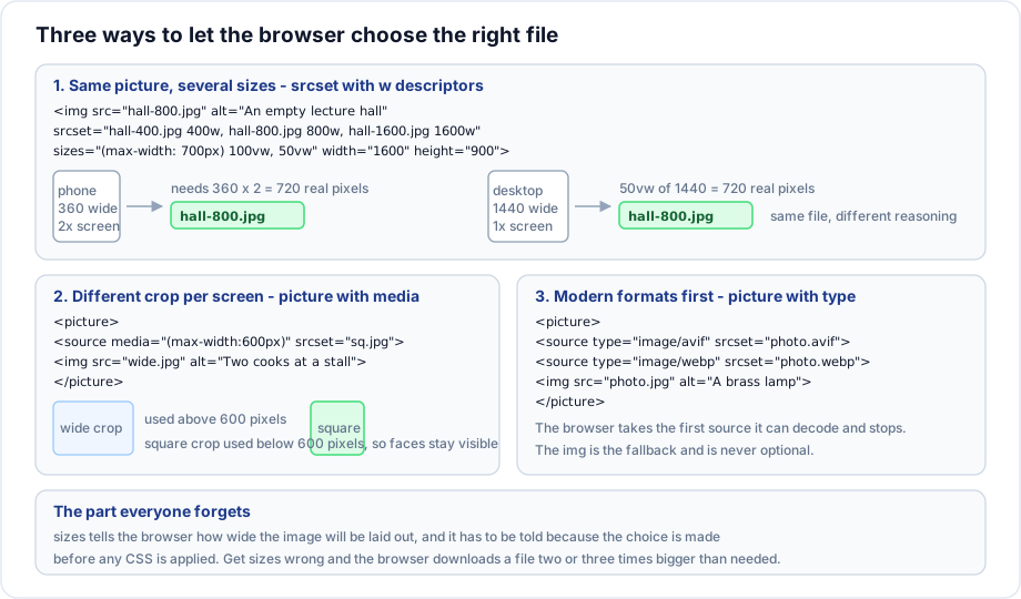
srcset with width descriptors
<img src="hall-800.jpg"
     srcset="hall-400.jpg   400w,
             hall-800.jpg   800w,
             hall-1600.jpg 1600w"
     sizes="(max-width: 700px) 100vw, 50vw"
     alt="An empty lecture hall"
     width="1600" height="900">
Read it as a table of offers. The w value is the real pixel width of each file - not a screen size, and not a breakpoint. The browser combines that with sizes and the device pixel ratio to decide.
Why sizes is required
This is the part that trips everyone up. The browser starts downloading the image before it has applied any CSS, so it does not yet know how wide the image will be laid out. sizes is you telling it in advance.
sizes="(max-width: 700px) 100vw, 50vw"

  Viewport 700px or narrower  ->  the image fills the viewport width
  Wider                       ->  the image is half the viewport width
The list is read left to right and the first matching condition wins, so the last entry has no condition and acts as the default. Omit sizes and the browser assumes 100vw, which usually means it downloads a file two or three times bigger than needed.
Pixel density descriptors
For a fixed size image such as a logo or an avatar, the simpler x form is enough:
<img src="avatar-1x.png"
     srcset="avatar-1x.png 1x, avatar-2x.png 2x, avatar-3x.png 3x"
     alt="" width="48" height="48">
No sizes is needed here because the layout width never changes. Do not mix w and x descriptors in one srcset.
picture for art direction
When a wide landscape crop turns into an unreadable strip on a phone, you do not want a smaller version of the same crop. You want a different picture.
<picture>
  <source media="(min-width: 1000px)" srcset="stall-wide.jpg">
  <source media="(min-width: 600px)"  srcset="stall-medium.jpg">
  <img src="stall-square.jpg" alt="Two cooks working at a roadside stall" width="800" height="800">
</picture>
The browser takes the first source whose media condition matches and stops looking, so order from largest to smallest. The img at the end is not optional: it is where alt, width, height and loading live, and it is the fallback when no source matches.
picture for modern formats
<picture>
  <source type="image/avif" srcset="lamp.avif">
  <source type="image/webp" srcset="lamp.webp">
  <img src="lamp.jpg" alt="A brass lamp on a workbench" width="1200" height="800">
</picture>
The browser picks the first type it can decode. AVIF and WebP are typically twenty five to fifty percent smaller than an equivalent JPEG, and the JPEG stays there for anything that cannot handle them.
Combining everything
<picture>
  <source type="image/avif"
          srcset="hall-400.avif 400w, hall-800.avif 800w, hall-1600.avif 1600w"
          sizes="(max-width: 700px) 100vw, 50vw">
  <source type="image/webp"
          srcset="hall-400.webp 400w, hall-800.webp 800w, hall-1600.webp 1600w"
          sizes="(max-width: 700px) 100vw, 50vw">
  <img src="hall-800.jpg"
       srcset="hall-400.jpg 400w, hall-800.jpg 800w, hall-1600.jpg 1600w"
       sizes="(max-width: 700px) 100vw, 50vw"
       alt="An empty lecture hall" width="1600" height="900" loading="lazy">
</picture>
Three formats, three sizes each, one alt text. Generate these variants with a build tool or an image service; writing them by hand does not scale.
Important rules
srcis still required on theimgas the fallback for browsers that ignoresrcset.- The
wdescriptor must be the true pixel width of the file. A wrong number produces a wrong choice. - Every
sourcemust be before theimg, and there must be exactly oneimg. alt,width,height,loadingandclassall go on theimg, never onsource.- The browser decides, not you. It may keep a larger cached file rather than downloading a smaller one, and that is correct behaviour.
- Do not mix
wandxdescriptors in the samesrcset.
Common mistakes
- Omitting
sizes, so the browser assumes full viewport width and over downloads. - Writing breakpoints into the
wdescriptors instead of actual file widths. - Ordering
picturesources smallest first, so the first one always matches. - Putting
altonsource, where it does nothing. - Using
picturefor simple resolution switching, wheresrcsetalone is enough. - Generating five sizes of an image that is only ever displayed at two hundred pixels.
Best practices
- Use
srcsetandsizesfor photographs in flexible layouts; usepictureonly for a real change of crop or format. - Three or four widths is usually enough. Doubling each time is a good rule.
- Keep
sizesin step with the stylesheet. When the layout changes,sizeshas to change too. - Automate variant generation.
- Check the actual downloaded file in the Network panel at several window widths. It is the only way to know it works.
Practice
- Build an image with three widths and a
sizesattribute for a layout that is full width on phones and half width above eight hundred pixels. - Open the Network panel, resize the window through the breakpoint, and confirm which file was fetched each time.
- Use
pictureto swap a wide crop for a square crop below six hundred pixels. - Add AVIF and WebP sources before a JPEG and compare the transferred bytes.