Headings h1 to h6 and the Document Outline
Headings are the table of contents of your page. Choose the level from where the section sits in the outline, never from how big the text should look.
-
HTML Basics
- What is HTML: The Structure Layer of Every Web Page
- HTML Document Structure: DOCTYPE, html, head and body
- Elements, Tags and Attributes: The Vocabulary of HTML
- HTML Comments: Notes That Ship With Your Code
- Block Level and Inline Elements
- Writing and Running Your First HTML Page
- How a Browser Turns Markup Into a Page
- Text and Formatting
- Links and Navigation
- Images and Media
- Lists
- Tables
-
Forms
- Form Structure: form, action and method
- Input Types: Text, Email, Number, Date and the Rest
- Labels: The Most Important Element in a Form
- Checkboxes, Radio Buttons and Grouping
- select, option, optgroup and datalist
- textarea, File Uploads and Hidden Fields
- Buttons: submit, reset and button
- Built In Form Validation
- GET or POST: What Happens When a Form Is Submitted
- Semantic HTML
- HTML5 Features
- Head and Metadata
- HTML with CSS
- HTML with JavaScript
- Accessibility
-
HTML SEO
- How Google Works: Crawling, Indexing and Ranking
- SEO Friendly HTML Structure
- Titles and Descriptions That Earn Clicks
- Headings and Content Structure for Search
- Internal Linking and Anchor Text
- robots.txt and XML Sitemaps
- Canonical URLs and Duplicate Content
- Structured Data and JSON-LD
- Image SEO
- Core Web Vitals and Mobile Friendliness
- DevTools and Debugging
- Editor Productivity
- HTML Best Practices
- HTML Projects
- Advanced Projects
- Practice and Exams
Concept
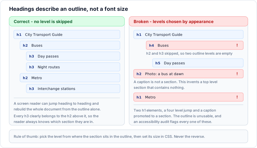
HTML gives you six heading levels, h1 through h6. They are not six sizes of text. They are six depths in an outline, exactly like the numbered sections of a report: 1, then 1.1, then 1.1.1.
The browser happens to render h1 largest and h6 smallest, and that coincidence is responsible for most of the bad heading markup on the web. The size is a default you will override in CSS within five minutes. The outline is permanent and is what every non visual reader depends on.
Syntax
<h1>Top level - what the whole page is about</h1>
<h2>A major section</h2>
<h3>A subsection of that section</h3>
<h4>A point inside the subsection</h4>
<h5>Rarely needed</h5>
<h6>Almost never needed</h6>
Example
<main>
  <h1>Setting up a home network</h1>
  <p>Everything below assumes a single broadband connection.</p>

  <h2>Choosing a router</h2>
    <h3>Coverage</h3>
    <h3>Wired ports</h3>

  <h2>Placing the router</h2>
    <h3>Height and obstructions</h3>
    <h3>Interference from other devices</h3>

  <h2>Securing the network</h2>
    <h3>Changing the default password</h3>
    <h3>Guest networks</h3>
</main>
Explanation
Read only the headings and you get a table of contents: one topic, three sections, two points under each. That is the test. If reading the headings alone does not describe the page, the levels are wrong.
The indentation above is only for the eye. Headings are siblings in the DOM; nothing nests them. Their relationship to one another is carried entirely by the number.
Why this matters so much
Screen reader navigation
Heading navigation is the single most used feature in screen readers. Pressing H moves to the next heading; pressing 2 moves to the next level two heading. Surveys of screen reader users consistently put headings at the top of the list of things they rely on to find their way around a page. Skipping a level leaves a hole in that map; using a heading for a caption puts a signpost where there is no road.
Search engines
The h1 is one of the strongest on page signals of what a document covers, and the h2 set tells a crawler how the topic is broken down. Featured snippets are frequently assembled from a heading and the paragraph beneath it. A page whose only h1 is the site name and whose real topic is buried in a styled div is throwing that away.
Machine generated outlines
Reading modes, article extractors, translation tools and documentation generators all rebuild structure from headings alone.
Important rules
- Do not skip levels going down. An
h2may be followed by anh3, not by anh4. Jumping back up is fine - anh4may be followed by anh2when a new major section starts. - Use one
h1per page. Multipleh1elements are technically permitted in the sectioning rules, but no assistive technology derives a useful outline from them, so in practice one is the correct answer. - The
h1should describe the page, not the site. The site name belongs in the header and the title. - A heading must have text. An empty heading, or a heading containing only an image with no alt text, is announced as a heading with no name.
- Headings are block level and may contain inline content only.
Common mistakes
- Choosing
h4because the text should be small. Chooseh2and style it small. - Using a heading for a caption, a label, a tagline or a piece of bold intro text. Those are paragraphs, or a
figcaption, or astrong. - Wrapping the logo in an
h1on every page, so every page in the site has the same top level heading. - Building a fake heading with
<div class="heading">. It looks identical and is invisible to the outline. - Starting a page at
h2becauseh1is styled too large in the theme. - Putting a block element inside a heading.
Best practices
- Write the headings before the prose. If the outline is right, the article usually writes itself.
- Keep headings short and descriptive. They are read out of context far more often than you expect.
- Front load the important words: Refund policy for annual plans rather than What you should know about our policy on refunds.
- Reset heading sizes in CSS deliberately, so that no one is ever tempted to pick a level for its size.
- Check the outline with a heading map extension or with the accessibility panel in DevTools before shipping.
Practice
- Take a page you have built and write out its headings in order with their levels. Does the list read as a table of contents?
- Find a page that skips from
h1toh3. Rewrite the markup so no level is skipped without changing how it looks. - Explain in one sentence why
<div class="title">Refunds</div>and<h2>Refunds</h2>can look identical but are not interchangeable. - Open DevTools on this page and list its headings using the accessibility tree.