Table Structure: table, tr, th and td
A table is for two dimensional data, never for layout. Learn the four core elements, the difference between th and td, and the test that tells you whether you need a table at all.
-
HTML Basics
- What is HTML: The Structure Layer of Every Web Page
- HTML Document Structure: DOCTYPE, html, head and body
- Elements, Tags and Attributes: The Vocabulary of HTML
- HTML Comments: Notes That Ship With Your Code
- Block Level and Inline Elements
- Writing and Running Your First HTML Page
- How a Browser Turns Markup Into a Page
- Text and Formatting
- Links and Navigation
- Images and Media
- Lists
- Tables
-
Forms
- Form Structure: form, action and method
- Input Types: Text, Email, Number, Date and the Rest
- Labels: The Most Important Element in a Form
- Checkboxes, Radio Buttons and Grouping
- select, option, optgroup and datalist
- textarea, File Uploads and Hidden Fields
- Buttons: submit, reset and button
- Built In Form Validation
- GET or POST: What Happens When a Form Is Submitted
- Semantic HTML
- HTML5 Features
- Head and Metadata
- HTML with CSS
- HTML with JavaScript
- Accessibility
-
HTML SEO
- How Google Works: Crawling, Indexing and Ranking
- SEO Friendly HTML Structure
- Titles and Descriptions That Earn Clicks
- Headings and Content Structure for Search
- Internal Linking and Anchor Text
- robots.txt and XML Sitemaps
- Canonical URLs and Duplicate Content
- Structured Data and JSON-LD
- Image SEO
- Core Web Vitals and Mobile Friendliness
- DevTools and Debugging
- Editor Productivity
- HTML Best Practices
- HTML Projects
- Advanced Projects
- Practice and Exams
Concept
A table presents two dimensional data: information where every value belongs to both a row and a column, and where you would naturally say the fee for Design in year two.
The test is simple. If removing the column headings would make the numbers meaningless, it is a table. If the content would read perfectly well as a list, it is not.
The four core elements
| Element | Meaning |
|---|---|
table | The whole grid |
tr | Table row - one horizontal line of cells |
th | Table header cell - labels a row or a column |
td | Table data cell - one value |
Syntax
<table>
  <tr>
    <th>Course</th>
    <th>Duration</th>
    <th>Fee</th>
  </tr>
  <tr>
    <td>Design</td>
    <td>3 years</td>
    <td>48,000</td>
  </tr>
  <tr>
    <td>Data science</td>
    <td>2 years</td>
    <td>54,000</td>
  </tr>
</table>
Note what is not there: no element for a column. A table is built from rows, and columns emerge from the position of cells within them. Every row must therefore have the same number of cells, or the grid tears.
th versus td
This is not a styling decision. th declares this cell labels other cells, and assistive technology uses it to give every data cell a context.
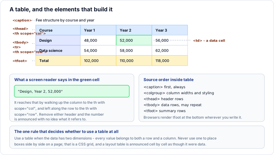
When a screen reader user moves to a number in the middle of a table, it does not read fifty two thousand. It reads Design, Year 2, 52,000 - because it walked up the column to the header and left along the row to the row header. Replace those th elements with td and the number is announced alone, in a grid the listener cannot see.
<table>
  <tr>
    <td></td>              <!-- corner cell, deliberately empty -->
    <th>Year 1</th>
    <th>Year 2</th>
  </tr>
  <tr>
    <th>Design</th>        <!-- this row is labelled too -->
    <td>48,000</td>
    <td>52,000</td>
  </tr>
</table>
A table can have headers on both axes. The empty top left corner is normal and correct.
Never use a table for layout
Before CSS layout existed, tables were how pages were arranged into columns. That era is over, and the practice is now actively harmful:
- A screen reader announces table with three columns and eight rows and then reads cell by cell, treating your page furniture as data.
- The markup cannot reflow on a narrow screen, so the layout breaks on a phone.
- The source order is locked to the visual order, so you cannot reorder for accessibility or for mobile.
- It is verbose, slow to parse, and painful to maintain.
CSS grid and flexbox do the job properly. If you find yourself writing a table with no headers, stop and ask what the data actually is.
Example
<table>
  <caption>Bus routes serving the campus</caption>
  <thead>
    <tr>
      <th scope="col">Route</th>
      <th scope="col">From</th>
      <th scope="col">First bus</th>
      <th scope="col">Frequency</th>
    </tr>
  </thead>
  <tbody>
    <tr>
      <th scope="row">12A</th>
      <td>Station Road</td>
      <td>06:10</td>
      <td>Every 20 minutes</td>
    </tr>
    <tr>
      <th scope="row">27</th>
      <td>Market Gate</td>
      <td>06:35</td>
      <td>Every 30 minutes</td>
    </tr>
  </tbody>
</table>
Explanation
The caption names the table, so a reader listing the tables on a page knows what this one holds. The column headers are marked scope="col" and the route numbers scope="row", which means every time is announced with both its route and its column. The data is genuinely two dimensional - a time belongs to a route and to a column - so a table is the right choice.
Important rules
- Only
trmay be a direct child of a row group, and onlythortdmay be a child oftr. - Every row needs the same number of cells, counting spans.
- The browser silently repairs a broken table, usually into something you did not intend.
- Whitespace between cells is ignored, so indent freely.
border,cellpadding,cellspacing,alignandbgcolorare obsolete presentational attributes. Use CSS.
Common mistakes
- Using a table to place two boxes side by side.
- Using
tdwith bold styling instead ofth, which looks identical and carries no meaning. - Rows with mismatched cell counts.
- Omitting the caption, leaving the table unnamed.
- Nesting a table inside a table cell for layout.
- Setting borders with the obsolete
borderattribute.
Best practices
- Use a table only for tabular data, and use a list, a description list or CSS grid for everything else.
- Mark every heading cell as
th, on both axes where both exist. - Give every table a
caption. - Set
border-collapse: collapseso borders do not double up. - Right align numeric columns and use tabular figures so digits line up.
Practice
- Mark up a four column timetable with headers on both axes and a caption.
- Take a table that has bold
tdcells as headers and convert them toth. What changes for a screen reader? - Find a layout built with a table and rebuild it with CSS grid.
- Write a table where one row is missing a cell, then inspect the DOM. What did the browser do?