Accessible Names and the Accessibility Tree
Every control has a name, a role and a state, and the browser works them out in a fixed order. Knowing that order explains almost every screen reader surprise.
-
HTML Basics
- What is HTML: The Structure Layer of Every Web Page
- HTML Document Structure: DOCTYPE, html, head and body
- Elements, Tags and Attributes: The Vocabulary of HTML
- HTML Comments: Notes That Ship With Your Code
- Block Level and Inline Elements
- Writing and Running Your First HTML Page
- How a Browser Turns Markup Into a Page
- Text and Formatting
- Links and Navigation
- Images and Media
- Lists
- Tables
-
Forms
- Form Structure: form, action and method
- Input Types: Text, Email, Number, Date and the Rest
- Labels: The Most Important Element in a Form
- Checkboxes, Radio Buttons and Grouping
- select, option, optgroup and datalist
- textarea, File Uploads and Hidden Fields
- Buttons: submit, reset and button
- Built In Form Validation
- GET or POST: What Happens When a Form Is Submitted
- Semantic HTML
- HTML5 Features
- Head and Metadata
- HTML with CSS
- HTML with JavaScript
- Accessibility
-
HTML SEO
- How Google Works: Crawling, Indexing and Ranking
- SEO Friendly HTML Structure
- Titles and Descriptions That Earn Clicks
- Headings and Content Structure for Search
- Internal Linking and Anchor Text
- robots.txt and XML Sitemaps
- Canonical URLs and Duplicate Content
- Structured Data and JSON-LD
- Image SEO
- Core Web Vitals and Mobile Friendliness
- DevTools and Debugging
- Editor Productivity
- HTML Best Practices
- HTML Projects
- Advanced Projects
- Practice and Exams
Concept
Alongside the DOM, the browser builds an accessibility tree: a parallel structure containing what assistive technology needs. Every node in it has four things.
| Property | Answers | Example |
|---|---|---|
| Name | What is it called? | Send enquiry |
| Role | What kind of thing is it? | button |
| State | What is its current condition? | disabled, expanded, checked |
| Description | Any extra detail? | Opens in a new tab |
A screen reader announces these in order. Send enquiry, button, disabled. If the name is missing, the reader hears button and has to guess.
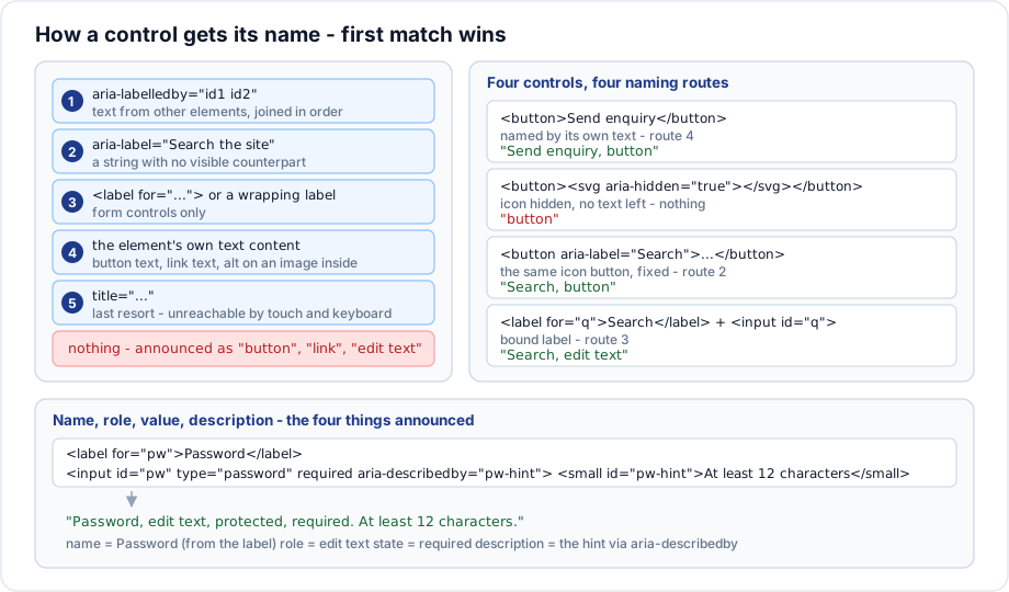
Where a name comes from
The browser checks these sources in order and takes the first that produces text.
1. aria-labelledby
<h2 id="billing">Billing address</h2>
<div role="group" aria-labelledby="billing">...</div>

<!-- several ids, joined in the order written -->
<button aria-labelledby="action-label item-name"></button>
<span id="action-label">Remove</span>
<span id="item-name">Brass lamp</span>
<!-- announced as "Remove Brass lamp" -->
The strongest source. It overrides everything below it, including visible text - which is powerful and easy to misuse.
2. aria-label
<button aria-label="Close dialog"></button>
<nav aria-label="Breadcrumb">...</nav>
A string with no visible counterpart. Use it only when there is genuinely no visible text to point at, because it cannot be translated by page translation tools and it is invisible to voice control users, who speak what they see.
3. A bound label element
<label for="email">Email address</label>
<input id="email" name="email">
Form controls only, and the correct default for them.
4. The element own text content
<button>Send enquiry</button>
<a href="/courses">All courses</a>
<a href="/"><img src="/logo.svg" alt="Riverside College home"></a>
The simplest and best route. Note the third case: an image inside a link contributes its alt text as the link name.
5. title
<button title="Close"></button>A genuine last resort. It is not shown on touch, not reachable by keyboard, and announced inconsistently.
6. Nothing
The control is announced as button, link or edit text, with no indication of what it does.
Name versus description
<label for="password">Password</label>
<input type="password" id="password" required
       aria-describedby="password-hint">
<small id="password-hint">At least twelve characters. A passphrase works well.</small>
Announced as: Password, edit text, protected, required. At least twelve characters, a passphrase works well.
The name is short and identifies the field. The description is longer detail. Putting the hint inside the label instead would make the name a whole sentence, repeated every time the field receives focus.
Roles
Every element has an implicit role, which is the main reason semantic markup matters.
| Element | Implicit role |
|---|---|
button | button |
a href | link |
nav | navigation |
main | main |
header at body level | banner |
footer at body level | contentinfo |
aside | complementary |
ul, ol | list |
table | table |
input type="checkbox" | checkbox |
div, span | none |
Do not restate an implicit role. <nav role="navigation"> adds nothing and is noise in a review.
States
<button aria-expanded="false" aria-controls="menu">Menu</button>
<div role="tab" aria-selected="true">Overview</div>
<input aria-invalid="true" aria-describedby="email-error">
<li aria-current="page">...</li>
<button aria-pressed="true">Bold</button>
<div aria-busy="true">Loading...</div>
State attributes must be kept accurate by whatever script changes the interface. An aria-expanded="false" that never changes is worse than none: it actively tells the reader something untrue.
Hiding from the accessibility tree
<!-- hidden from assistive technology, still visible -->
<span aria-hidden="true">→</span>

<!-- hidden from everyone -->
<div hidden>...</div>

<!-- visible only to assistive technology -->
<span class="visually-hidden">(opens in a new tab)</span>

<!-- an entire subtree made unreachable -->
<div inert>...</div>
Never put aria-hidden="true" on a focusable element. It creates a control a keyboard can reach but a screen reader cannot describe - the worst possible combination. Use inert for a whole region that should be unreachable.
Inspecting the tree
Every browser exposes it. In Chrome, the Elements panel has an Accessibility pane showing the computed name, role, state and the full tree; Firefox has a dedicated Accessibility panel.
Selecting an element and reading its computed name is the fastest way to answer why is this announced like that. It is worth doing for every icon button on a page.
Important rules
- The naming order is fixed and the first match wins.
aria-labelledbyoverrides visible text, so a wrong one is invisible to sighted reviewers.- Referenced ids must exist. A missing id produces no name at all.
- Do not restate implicit roles.
- State attributes must be kept in step with reality.
aria-hiddenmust never be on something focusable.
Common mistakes
- Icon only buttons with no name.
aria-labelwhere visible text exists, which then disagrees with what a voice control user says.aria-labelledbypointing at an id that does not exist.- Hint text inside the label, making the name a paragraph.
- Stale
aria-expandedvalues. role="navigation"on anav.aria-hidden="true"on a link or a button.
Best practices
- Prefer visible text as the name. It works for screen readers, voice control and translation at once.
- Use
aria-labelonly when there is nothing visible to use. - Keep names short; put detail in
aria-describedby. - Check the computed name in DevTools for every icon control.
- Update state attributes in the same function that updates the interface.
- Use
inertrather than scatteringaria-hidden.
Practice
- Open DevTools and read the computed accessible name of five controls on a page you built.
- Give an icon button a name three different ways and compare the announcements.
- Move a hint from inside a label to
aria-describedbyand listen to the difference. - Point
aria-labelledbyat a missing id and check what the computed name becomes.