Core Web Vitals and Mobile Friendliness
Three measurements taken from real visits, and one indexing rule that decides which version of your page Google actually reads.
-
HTML Basics
- What is HTML: The Structure Layer of Every Web Page
- HTML Document Structure: DOCTYPE, html, head and body
- Elements, Tags and Attributes: The Vocabulary of HTML
- HTML Comments: Notes That Ship With Your Code
- Block Level and Inline Elements
- Writing and Running Your First HTML Page
- How a Browser Turns Markup Into a Page
- Text and Formatting
- Links and Navigation
- Images and Media
- Lists
- Tables
-
Forms
- Form Structure: form, action and method
- Input Types: Text, Email, Number, Date and the Rest
- Labels: The Most Important Element in a Form
- Checkboxes, Radio Buttons and Grouping
- select, option, optgroup and datalist
- textarea, File Uploads and Hidden Fields
- Buttons: submit, reset and button
- Built In Form Validation
- GET or POST: What Happens When a Form Is Submitted
- Semantic HTML
- HTML5 Features
- Head and Metadata
- HTML with CSS
- HTML with JavaScript
- Accessibility
-
HTML SEO
- How Google Works: Crawling, Indexing and Ranking
- SEO Friendly HTML Structure
- Titles and Descriptions That Earn Clicks
- Headings and Content Structure for Search
- Internal Linking and Anchor Text
- robots.txt and XML Sitemaps
- Canonical URLs and Duplicate Content
- Structured Data and JSON-LD
- Image SEO
- Core Web Vitals and Mobile Friendliness
- DevTools and Debugging
- Editor Productivity
- HTML Best Practices
- HTML Projects
- Advanced Projects
- Practice and Exams
Concept
Core Web Vitals are three measurements of what a page feels like to use, collected from real visits rather than from a lab. They are a ranking input - a modest one, but a real one, and every improvement helps the reader regardless.
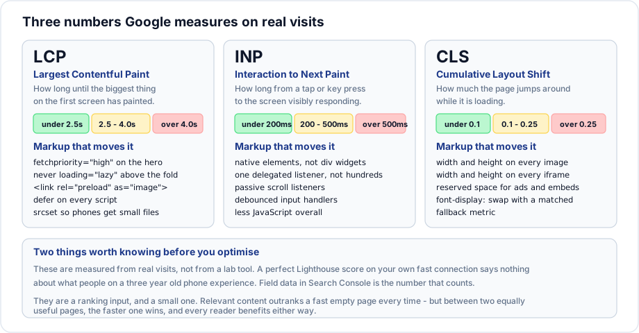
Largest Contentful Paint
How long until the largest element on the first screen has painted. Usually the hero image or the main heading block.
| Good | Needs improvement | Poor |
|---|---|---|
| Under 2.5s | 2.5 to 4.0s | Over 4.0s |
<head>
  <link rel="preload" as="image" href="/images/hero-800.jpg"
        imagesrcset="/images/hero-400.jpg 400w, /images/hero-800.jpg 800w"
        imagesizes="100vw" fetchpriority="high">
  <script src="/scripts/app.js" defer></script>
</head>
<body>
  <img src="/images/hero-800.jpg"
       srcset="/images/hero-400.jpg 400w, /images/hero-800.jpg 800w, /images/hero-1600.jpg 1600w"
       sizes="100vw"
       alt="The main gate at sunrise"
       width="1600" height="900"
       fetchpriority="high">
</body>
What moves it, in order of usual impact: server response time, blocking resources in the head, hero image size, and priority hints. Never lazy load the hero - deferring the measured element makes the measurement worse.
Interaction to Next Paint
How long from a tap, click or key press until the screen visibly responds. It replaced the older First Input Delay measurement in 2024 and is stricter, because it looks at every interaction rather than only the first.
| Good | Needs improvement | Poor |
|---|---|---|
| Under 200ms | 200 to 500ms | Over 500ms |
This is mostly a JavaScript measurement, and the markup decisions that help are the ones covered earlier in this path:
- Native elements instead of custom widgets, so the browser does the work rather than your script.
- One delegated listener rather than hundreds of individual ones.
- Passive scroll listeners.
- Debounced input handlers.
- Less JavaScript overall - a large framework loaded for a mostly static page is the usual cause.
Cumulative Layout Shift
How much visible content moves around unexpectedly while the page loads. The reader experiences it as content jumping just as they go to tap something.
| Good | Needs improvement | Poor |
|---|---|---|
| Under 0.1 | 0.1 to 0.25 | Over 0.25 |
The causes are short and all fixable in markup:
<!-- images and iframes without dimensions -->
<img src="/images/hall.jpg" alt="An empty hall" width="1600" height="900">
<iframe src="..." title="Campus tour" width="800" height="450"></iframe>

<!-- ads and embeds inserted later: reserve the space -->
<div class="ad-slot" style="min-height: 250px"></div>
/* web fonts: swap in without reflowing the whole page */
@font-face {
font-family: "Inter";
src: url("/fonts/inter.woff2") format("woff2");
font-display: swap;
size-adjust: 100%; /* match the fallback metrics */
}Also: never insert content above existing content after load. A cookie banner or a notification bar pushed in at the top moves everything below it.
Mobile first indexing
Google indexes the mobile version of a page. Not the desktop version. This has been the default for years and its consequences are still routinely missed.
If content exists on your desktop layout but is hidden or omitted on mobile, it may not be indexed at all.
Which means:
- Do not serve less content on mobile. Collapse it behind a disclosure widget if space is tight - content inside a closed
detailsis still in the DOM and still indexed. - Structured data must be present in the mobile version.
- Metadata - title, description, canonical - must match across versions.
- Images must be present on mobile, with the same alt text.
The mobile checklist
<meta name="viewport" content="width=device-width, initial-scale=1">- Viewport meta tag on every page.
- No horizontal scrolling at 320 pixels wide.
- Tap targets around forty four pixels, with space between them.
- Form fields at sixteen pixels or larger, so iOS does not zoom.
- Body text at sixteen pixels or larger.
- No intrusive interstitials covering the content on arrival - these are explicitly penalised.
Measuring it properly
| Tool | Data |
|---|---|
| Search Console Core Web Vitals | Real visits to your site, grouped by URL |
| PageSpeed Insights | Real visit data plus a lab run for one URL |
| Lighthouse in DevTools | A lab run on your machine |
| The web-vitals library | Real visits, reported to your own analytics |
The distinction matters. A Lighthouse score on a fast laptop and a fibre connection says very little about a three year old phone on mobile data. Field data is the number that counts, and it is what Search Console reports.
Always test with throttling on. The browser can simulate a slow connection and a slow processor, and the result is much closer to what most readers experience.
Keeping perspective
Core Web Vitals are one input among many, and content relevance outweighs them heavily. A fast page with nothing to say will not outrank a slower page that answers the question.
Between two comparable pages, the faster one wins - and more importantly, the faster one is better for every reader whether or not it changes a ranking. That is the reason to do it.
Important rules
- Field data from real visits is what Google uses.
- LCP under 2.5s, INP under 200ms, CLS under 0.1.
- Mobile is what gets indexed.
- Content missing from the mobile version may not be indexed.
- Content in a closed
detailselement is still indexed. - Intrusive interstitials on arrival are penalised.
Common mistakes
- Optimising for a Lighthouse score instead of field data.
- Lazy loading the hero image.
- Missing image and iframe dimensions.
- Serving reduced content on mobile.
- Cookie banners inserted above the content after load.
- Testing only on a fast connection.
- Chasing a perfect score at the expense of the content.
Best practices
- Set
widthandheighton every image and iframe. fetchpriority="high"on the hero,loading="lazy"below the fold.deferon every script.- Reserve space for anything inserted later.
- Use
font-display: swapwith matched fallback metrics. - Serve the same content on mobile and desktop.
- Watch the Search Console report over time rather than a single run.
Practice
- Run PageSpeed Insights on a page and compare the field data with the lab score.
- Remove image dimensions from a page and measure the layout shift, then restore them.
- Compare the content served to a mobile viewport with the desktop version. Is anything missing?
- Throttle to a slow connection and a slow processor, then reload and record the LCP.